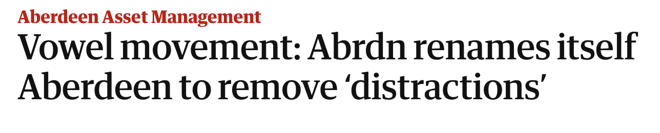
It was the most mocked rebrand in years. In 2021, when most companies were worrying about the pandemic, the Aberdeen investment company decided vowels were so yesterday, and renamed itself Abrdn. It claimed the change reflected a ‘modern, agile, digitally-enabled brand’. The move was almost universally mocked, with the group accused of suffering from irritable vowel syndrome. It didn’t help that the new Abrdn had to explain that the name was still pronounced … Aberdeen.
Last year, in a cringeworthy cry of pain, Abrdn’s chief investment officer Peter Branner complained that the mockery amounted to corporate bullying, saying such abuse wouldn’t be allowed if Abrdn was an individual. He told Financial News:
‘I understand that corporate bullying to some extent is part of the game with the press, even though it’s a little childish to keep hammering the missing vowels in our name.’
Branner’s pitiful outcry was equally mocked. City AM had fun with a headline reading ‘Abrdn: an apology – sry we kp tkng th pss ot of yr mssng vwls”.
This week, Abrdn threw in the towel, and conceded that vowels weren’t so bad after all. It will now be branded aberdeen group. Yes, without a capital A. Think of it as a matter of pride – a go-ahead brand can’t be expected to go all conventional overnight.
‘We will deliver by looking forward with confidence and removing distractions. To that end, we are changing our name to aberdeen group plc. This is a pragmatic decision marking a new phase for the organisation, as we focus on delivering for our customers, people and shareholders.’
This kind of corporate gobbledegook is sadly common. It means nothing. Is Windsor really admitted that Abrdn – sorry, aberdeen group – hasn’t been focusing on its customers, people and shareholder during its four year campaign against innocent vowels? And talk of removing ‘distractions’ ignores the fact that it was Aberdeen that caused the distraction in the first place.
Changing your corporate identity can be a good move

None of this fun at Aberdeen’s expense is to deny that a corporate identity makeover can be a good thing – even essential. I’ve previously blogged in praise of British Rail’s 1964 identity, elements of which still look fresh on Britain’s rail network 61 years on, almost 30 years after BR was privatised.
But change needs to be considered, and not just by marketing and design experts. Had Aberdeen spoken to reputation management experts, it would surely have predicted a backlash long before being hit by painful no-vowel headlines. Royal Mail went through a similarly expensive experience 24 years ago when it renamed itself Consignia. The chief executive came up with a corker of a justification: ‘The new name describes the full scope of what the Post Office does in a way that the words ‘post’ and ‘office’ cannot’. Even better was this from Keith Wells from Dragon Brands, which came up with Consignia:
‘It’s got consign in it. It’s got a link with insignia, so there is this kind of royalty-ish thing in the back of one’s mind. And there’s this lovely dictionary definition of consign which is ‘to entrust to the care of’. That goes right back to sustaining trust, which was very important.’
Within a year, the company decided that ‘royal’ and ‘mail’ and ‘post’ and ‘office’ would do very nicely after all.
The company that dithered: a tale of two logos

Yes, the same company annual report, with different logos. I was responsible for producing them, but not for the indecision about which logo to use.
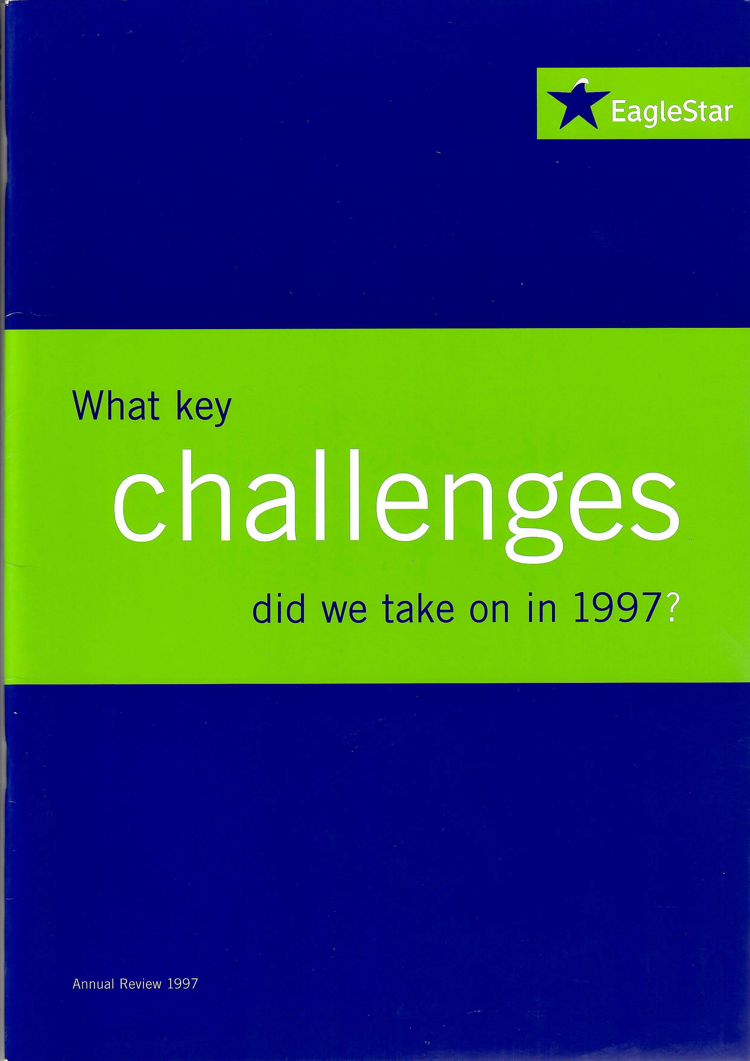
In 1998, Eagle Star insurance was about to merge with Zurich Insurance. The company’s leadership decided to refresh its elegant but rather dull corporate identity, which echoed its origins in the Eagle insurance company of 1807. Lime green was all the rage in 1998, so featured heavily. The new logotype was curious, resembling a curled up sticker. The

The new corporate identity was unveiled early in 1998, with a strapline ‘easier to use, easier to understand’ reflecting the intention to make using Eagle Star and its insurance products much more customer-friendly. As all this was going on, I had the job of producing Eagle Star’s last annual report and accounts as an independent company. I worked with an excellent London design company called The Partners to produce a two part publication: an annual review, telling the story of the year, and the annual financial accounts. The project was going well, and I was looking forward to spending a few days on location in Leith, Edinburgh, overseeing the printing.
At this point, Eagle Star’s leadership team began to have second thoughts about the vibrant new identity and logo. Did it go to far? In a classic example of kicking the can down the road, it decided not to make a decision. So I had to produce a second version of the documents with the old logo, and print both. The ones with the new logo never saw the light of day. We published the versions with the uneasy blend of lime green and traditional logo. Soon after, the entire new identity was ditched for the last few years of the brand’s life under Zurich ownership.
Postcript: the rain in Spain
I went on three photoshoots in 1998 for that Eagle Star annual report. The first was to photograph the Essex man who had bought the world’s first online car insurance policy from Eagle Star. After several hours in the freezing cold outside his house, I was looking forward to a warm session days later in Barcelona. But the photoshoot with the bosses of Eagle Star’s Spanish business in the shadow of Gaudí’s famous unfinished Sagrada Familia church took place under chilly rain showers. I then took the rain to Johannesburg, while staying in a motel in the middle of nowhere with no restaurant. I grabbed a sandwich dinner from a nearby petrol station. Don’t believe anyone who says international business travel is always glamorous…
